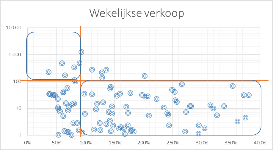
In order to fully understand this complexity, we look at the whole portfolio during an assessment, and how it behaves over time. In particular, the volume relative to the fluctuations is analysed in a product-specific manner, and this is visualized in the following graph.

This graph is a typical representation of a product portfolio. The top left shows the products that we all like to produce, namely the "runners" that always sell and that are also stable. Traditionally, these are the products for which lean tools work best, and with which you can also get the most amazing results.
At the bottom-right are the products that are not interesting products from a production perspective, namely the unstable "slow movers". But instead of immediately discarding these products, it is better to look at the added value of these products, and how best to deal with them in this respect.
By making this analysis, we obtain a good understanding of customer demand, and are able to reflect this customer demand in the existing production processes and systems. And that always provides surprising insights on starting with an operational excellence trajectory.


