From data to decision: dos and don'ts for powerful dashboards
Dashboards have become an indispensable part of meetings and daily follow-ups. Whereas a few years ago you still had to compile reports manually to quickly show the results of the previous day, most organisations now have automated, standardised visuals that do the job for them.
But visualisation alone is not enough. A dashboard is only valuable when it helps the user make faster and better decisions. In this series, I will take you through the dos and don'ts of dashboarding, so that you can avoid pitfalls and make an impact. In this first episode, we will focus on the fundamental principles.
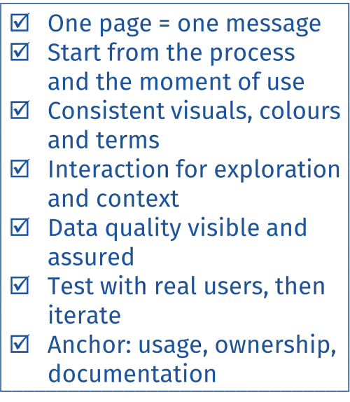
1) Start with a clear question and a defined target group
A dashboard is not an end in itself, but a tool within a larger process. To make a real impact, as a developer you need to understand where in the process the dashboard will be used, by whom and for what purpose. This is in line with the Lean principle of Value Stream Thinking: visualisations must add value for the end user, not just display data.
Ask yourself the following questions:
- Analyse the process in which the dashboard will function. What steps does the user go through? Where do bottlenecks or decision moments arise? What data is relevant in those situations?
- Formulate the user goal as clearly as possible and translate it into one or more defined messages.
- Limit each page of your dashboard to one clear message that invites action.
Avoid this:
- Building a dashboard without understanding the operational process. Visualisations that are disconnected from the reality on the work floor lack relevance and are rarely used. Think less in terms of “what can we show?” and more in terms of “what does the user need to know in order to take action?”.
- Also keep your target audience in mind. An operational dashboard in production requires a different approach than a quarterly report for management. Even with the same source data, the visualisation, language and moment of use – and therefore the structure – will differ.
2) Understand the data flow
A dashboard is the final link in a chain. Its quality and usability depend on everything that happens before it.
Ask yourself the following questions:
- How was the data collected? What input limitations exist?
- What granularity do you have (minute, hour, day, week) and does it fit the decision moment?
- Are calculations and definitions unambiguous and documented?
A strong visual analysis is worthless if the underlying data is incomplete or incorrect.

3) Put consistency and intuition to work
A dashboard should not only be informative, but also feel familiar. Therefore, align it with existing reports that your target group is familiar with.
Ask yourself the following questions:
- Is a particular KPI traditionally displayed as a line graph? Keep it that way.
- Is there a fixed colour logic for positive vs. negative trends? Apply it consistently.
- Use terminology that is familiar to the workplace.
Avoid this:
- Reinventing the wheel every time. New graph types, different colours or other terms take the user out of their flow – especially if dashboards are consulted quickly and often.
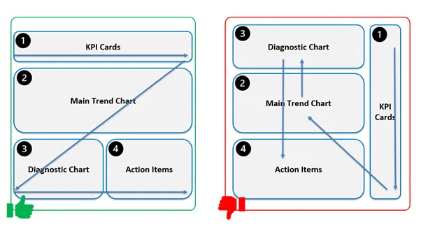
- Consider the reading flow: a Z-pattern structure (top left → top right → diagonally to bottom left → bottom right) is in line with the natural reading direction in a Western context. Will the dashboard be used internationally? Take cultural differences in reading direction and interpretation into account.

4) Make your dashboard interactive
A strong visual displays data and invites exploration. With filters, dropdowns, drill-throughs or clickable graphs, you give users the space to delve deeper themselves. This allows you to evolve from a static report to an analysis tool.
Avoid this:
- A snapshot dashboard without interaction. This leaves the user dependent on what you have chosen to show. Interactivity stimulates curiosity and provides context when needed.
5) Monitor your data quality
A dashboard is only as good as the data it contains. You are responsible for ensuring that the figures are accurate, up to date and reliable.
Best practices:
- Test data connections, check filters and validations, and verify calculations/definitions.
- Build in a visual indicator that shows when the data was last updated.
- Provide fallbacks or alerts if a refresh fails.
Absolutely avoid:
- Blindly relying on automatic updates. A dashboard that still shows figures from last week because the refresh failed undermines decisions and trust.
6) Test and improve
A dashboard is not a finished product, but a living tool.
- Have it tested by someone who has never seen the dashboard before. Observe where that person gets stuck, what is unclear and where context is missing.
- Iterate based on that feedback and follow up to see whether the visualisation actually speeds up or improves decision-making.
Absolutely avoid:
- Publishing it and then forgetting about it. Needs evolve – your dashboard must evolve with them to remain relevant.
7) Embed it in the organisation
Technical:
Ensure that the dashboard and documentation do not disappear into a forgotten folder on OneDrive, but live where they belong – with shared ownership of the process in which the dashboard plays a role. Consider version management, access rights, definitions, changelog and onboarding.
Operational:
Ensure that the dashboard is actively used in the (decision-making) process. Make it standard in consultation moments and perform regular usage checks: is it still being used and used correctly? Consider, for example, the active use of an Obeya dashboard.
What's next?
In the following episodes, we will delve deeper into each principle, with concrete examples, visual tips and practical cases. Together, we will build dashboards that are not only beautiful, but also really work.
Want to read more?
Want to apply these tips right away? Be sure to check out colleague Kurt's blog series on the usefulness of graphs in decision-making and how to choose the right graph for your use case.
Want to learn more? Are you struggling to convert data into insights in your organisation? Would you like practical insights into how to get started? Discover our modular training course.

Contact us so we can work on solutions together.

Stanwick. Drive for results
Stanwick offers result-oriented coaching programmes on operational excellence, project excellence and supply chain excellence with a focus on people, organisations and processes. We perform thorough assessments, develop clear roadmaps and implement and anchor improvements to guarantee sustainable results.
Our Stanwick Academy organises extensive training courses in which you learn together with a like-minded community about project management, continuous improvement, data-driven organisations, leadership and change management.


