


Do's & Don'ts of Dashboarding – Understanding the Data Flow

A dashboard does not simply display figures - it is the end an entire journey the information has travelled: from source to decision-making moment. Those who understand this journey are able to build dashboards that are reliable, provide better insights and support better decisions.
To map out this journey, we start with a process map, e.g. a Makigami Process Map, which lists both the operational tasks and the digital systems in which the data is imported or adjusted. As with Value Stream Mapping (VSM), you do not only draw the process steps, but also the information flow and decision points. The goal is flow: a smooth, uninterrupted movement from data over to insight to action, while also identifying bottlenecks (slow refresh, missing data, unclear KPIs). This makes the data flow visible and improvable, just as a VSM does for physical operations.
1. Draw the end-to-end information flow first
Sketch out on one page how data flows between the process steps. By keeping track of the sources (lists, Excel files, databases, etc.), their owners and any underlying operations, you can avoid blind spots and unreliable data within your dashboard.
Do: Treat this as a process: draw both the information flow (data & definitions) and the decision moments (who does what with the insights?). A Makigami Process Map can potentially offer insights into data flows that require a great deal of human interaction.
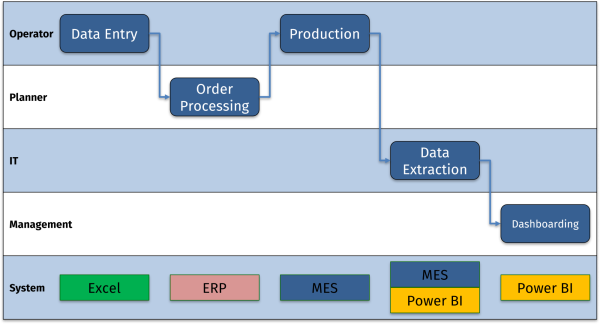
Don't: Immediately think in terms of graphs or visualisations. First, make sure you have a clear understanding of the flow and where in the process the information will be accessed and used.
2) Identify sources, ownership and reliability
Now that you know which sources and owners you have based on your process map, you can clearly discuss who will take on which role in terms of both management (IT or a dedicated expert within the team) and operational responsibility for the quality of the data source. You should also establish clear guidelines and quality requirements for the future. If possible, these should be embedded in the system by building in controls.
We call someone who takes on this role a data steward. Their responsibility is to ensure that how we measure or record data is reliable and reproducible. In addition, the business owner determines what needs to be measured and why.
Do: Use a RACI Matrix to clearly define roles and responsibilities.
Don't: Use spreadsheets as a database without agreements or as a long-term solution. The danger of spreadsheets is that corrupt data can creep in more quickly than in a controlled environment with minimal human interference. Even with a strict data steward, the risk here is very high.
3) Choose the right delivery and refresh strategy
To make a dashboard useful, it is important that the most recent data update possible can be provided at any time. For example, you would expect a daily kick-off meeting that discusses the previous day's results to have those results available, and a PMO (Project Management Office) Dashboard to also have the latest updates on project statuses.
Do: Document a clear refresh strategy “Daily at 6 a.m.” is more clear than “Daily.” Also, ensure that this timing fits the usage needs of the dashboard.
Don't: Blindly rely on automatic updates. Instead, provide a visual “data last refreshed” indicator and always ensure that a manual option is available to refresh the data.
4) Make KPI definitions explicit (and reusable)
When defining KPIs (Key Performance Indicators), it is not only important that everyone knows what we are talking about, but also that we know and understand exactly how we arrive at a KPI. This ensures that KPIs can be interpreted uniformly across different teams. So make sure that a certain business logic is incorporated and use unambiguous definitions (e.g. “OTIF” = on time AND in full; “on time” = delivered ≤ planned delivery date, “in full” = complete order).
Once developed, store them centrally in the model and reuse the same calculations in different dashboards and reports.
Do: Develop a centrally managed KPI library with definitions and calculations.
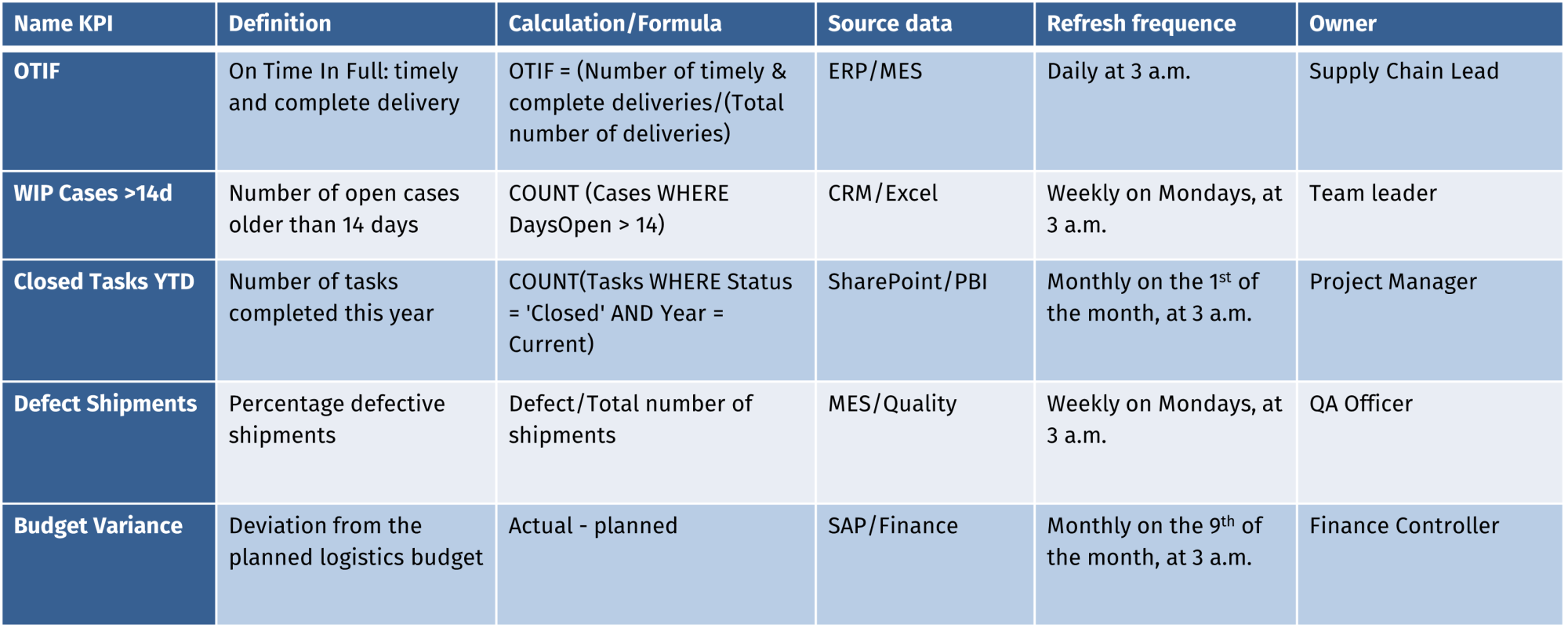
Don't: Calculate the same KPI slightly differently in three different places. Instead, ensure you have a single source of truth. We often see this with metrics that are used across different sites, where each site uses its own definition.
5) Design with performance and maintenance in mind
Use different tables and connect them in a data model (e.g. Star Model) and do not store everything in one table with different operations. This will not only speed up data refreshes, but also make problems easier to solve.
Try to reuse data transformations as much as possible to avoid unnecessary operations and potential errors.
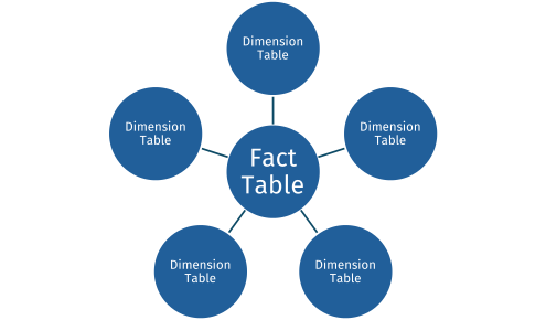
Do: Use relational models to avoid redundancy.
Don’t: Collect everything in one workbook/dataset. Instead, split the source transformations of the model and the visualisation.
6) Build in quality control (and not just at the end)
Ensure that data quality is visible to end users by means of simple metrics for data quality: how old is the data, what percentage of the fields have been filled in (important for manually entered data), are there certain values that do not make sense in the context of the process and reality (e.g. a sensor that measures temperatures below 0 degrees Celsius or an OTIF of > 100%) etc.
Do: Build control points into the dashboard to check quality.
Don't: Only notice that the figures are strange when you look at the graph. Instead, put control points in place before the model and before publication. This is also Lean logic: build in quality, don't check it afterwards.
7) Document: make the data flow part of your story
When delivering your dashboard, publish it where your target audience expects it (Teams/SharePoint for the dashboard). The more accessible the dashboard, the more often it will be used and the more impact you will have.
In the same place, you should also provide the necessary documentation about the dashboard (RACI of ownership, refresh policies, etc.).
Do: Centralised and standardised locations for dashboards and dashboard-related documentation.
Don't: Leave documentation floating around in separate notes. Instead, link it to the report.
With these data quality guidelines in mind, you can actively start interpreting the data and framing how a dashboard should be created. Understanding the context of the data (flow) can also help you further refine the purpose and goal of the dashboard, thereby providing even better support for decision-making.
In the next article, we will take a closer look at how you can better understand the demand and business needs and how you can convert these into an initial visualisation.
Contact us so we can work on solutions together.

Stanwick. Drive for results
Stanwick offers result-oriented coaching programmes on operational excellence, project excellence and supply chain excellence with a focus on people, organisations and processes. We perform thorough assessments, develop clear roadmaps and implement and anchor improvements to guarantee sustainable results.
Our Stanwick Academy organises extensive training courses in which you learn together with a like-minded community about project management, continuous improvement, data-driven organisations, leadership and change management.