


Powerful dashboards: From business question to initial visual

In previous blogs, we’ve already looked at some key fundamentals of data-driven working. But between those two steps – from data stream to dashboard – there’s a crucial phase that’s all too often overlooked: understanding the business question and translating the relevant information into an initial, illuminating visualisation. It’s precisely here that many teams make the difference between simply showing data and effectively communicating visually.
“No chart, no meeting!” may be a catchy slogan, but a visualisation that misses the point is arguably even worse than no visualisation at all.
A question is rarely visual or clear
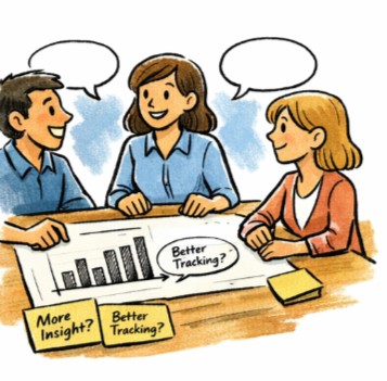
In practice, a question tends to start out rather vaguely: “We want more insight” or “We want to monitor this better” are classic examples that should ring a bell. Usually, we immediately start thinking in terms of solutions, whilst the question isn’t actually sharp enough yet to move towards a solution or to start visualising.
Anyone who has read our previous blog on data flows will recognise this pattern: just as you shouldn’t jump straight to visualisations before you understand how data flows through the process, the same principle applies here. You can only design something meaningful once you understand why someone will be looking at that visual and what they need to do with it.
A visualisation is not an answer to a question. It is a conversation tool that helps to explore the question together. So try to explore the need together first before moving on to possible solutions.
Business needs are human, not abstract
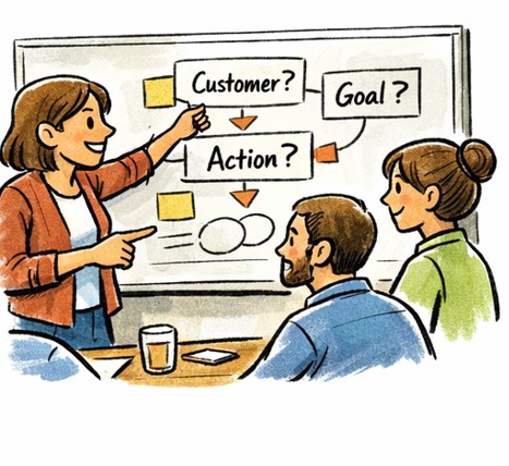
Business needs do not exist on paper, but in people’s minds. They live with managers who have to make decisions, with teams that need to adjust course, and with people on the shop floor who want to understand whether things are going well. Data-driven communication therefore means that you first listen to what is going on, with whom it is happening and why it is happening, before you decide what to show.
The blog From data to decision already emphasised that dashboards are only valuable when they align with the process, the moment of use and the target audience. Visualisations that do not connect with the reality on the shop floor rarely find their way into practice, even if the figures themselves are correct.
The first visual is a hypothesis, not a finished product
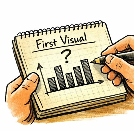
The same logic applies to the very first visual. It must align with the way people already talk, hesitate and make decisions today. This visualisation must therefore, above all, be recognisable and able to inspire confidence.
A common mistake is to assume that a first attempt must be ‘finished’ straight away and must map out the problem. But strong data-driven communication actually starts with an imperfect visual: a first sketch that helps to open the conversation.
You could compare it to a whiteboard in a meeting: no one expects what’s on it to be perfect. The aim is not to convince, but to explore. The first visual does exactly the same: it makes assumptions explicit, shows what we think we see, and invites us to refine it together.
This ties in with the principle from the first blog in this series: think less in terms of “what can we show?” and more in terms of “what does someone need to understand to act better today?”.
From question to visualisation
When organisations struggle with data-driven working, it is rarely due to a lack of data, but to a lack of translation. A team asks a question in words and the data – often supplied by another team – answers in figures, but somewhere along the way the meaning is lost.
Incorporating storytelling elements into the translation of business needs fills that gap exactly. Not by making the figures look prettier, but by placing them in a context that people recognise. And by using visualisations to start a dialogue rather than simply drawing a conclusion.
A strong initial visual is therefore not a matter of design or technical perfection. It works because it stems from a genuine business need, because it provides context, and because it gets the conversation going. At that point, the visual is not a report, but a shared reference: “this is what we’re looking at together today”.
But the work doesn’t stop there. Because even if a visual is logically structured, one crucial question remains: does it actually work for the people who have to use it? Do they see the same thing? Do they understand what’s important? Does the visual help the conversation move forward, or does it just stall it?
In the next blog, we’ll explore that question in detail. We’ll look at how you can assess whether a visual ‘works’, what indicators you can use to do so, and how you can test a visual before it becomes a dashboard. Not technically, but in terms of interaction.
Because data-driven communication doesn’t stop at drawing a graph; it only really begins when the conversation gets going.
Contact us so we can work on solutions together.

Stanwick. Drive for results
Stanwick offers result-oriented coaching programmes on operational excellence, project excellence and supply chain excellence with a focus on people, organisations and processes. We perform thorough assessments, develop clear roadmaps and implement and anchor improvements to guarantee sustainable results.
Our Stanwick Academy organises extensive training courses in which you learn together with a like-minded community about project management, continuous improvement, data-driven organisations, leadership and change management.