
During projects and training sessions, I sometimes receive a dataset from one of the participants. An unfortunate observation, which I make all too often, is that the data structure and data quality leave something to be desired. I am not talking here about the content of the supplied tables, but about how the tables themselves look. These simple guidelines can ensure that the data are much easier to process and use, enabling high quality data analyses:
- Always work with simple, completely filled columns. Especially when it comes to result data, specification data, setting data and time stamp data. Start in the first available cell in your spreadsheet. Specific data processing software will often force you to do so.
- Always use the first column for the time stamp. When was each measurement point taken. And also note who registered the data point, with which measuring equipment and with which protocol. I have mentioned three obvious items, but this list can become quite long. What needs to be measured and recorded can be prepared using a data collection plan. However, even a simple Ishikawa charting the 6M's can get you a long way.
- Keep column headings simple, unambiguous, singular and short. Data for specifications, units, etc... are better left in an extra column. If you don't do this and want to import this data later into specific data processing software, violating this simple rule will often lead to mistakes.
- Avoid all the bells and whistles that are available in today's spreadsheets. Certainly use these possibilities in reports and conclusions, but not in data tables. Data processing software often stumbles over this too.
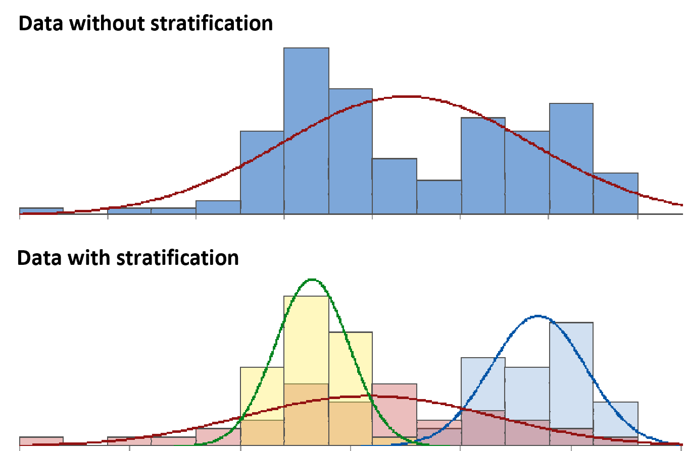
Besides a qualitative table, the content is also important. In addition to a sufficiently large sample, there are two other important points of attention: 1) Make sure the data is representative of what you want to visualise and 2) Make sure you include the context. This will make it easier to apply data stratification and to ensure clearly interpretable graphs.
In the coming weeks, I will regularly publish a continuation of this topic and focus on the different groups or categories of graphs. The most common graphs can be divided into four groups: 1) Graphs that visualise categories within the data itself, 2) Graphs that visualise frequency of occurrence, 3) Graphs that visualise time effects and 4) Graphs that visualise a relationship between two or more parameters.